Cards
For Large and Small Screens
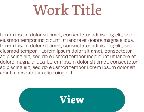
This is the design for cards as they would appear on both large and small screens.
Usage and Best Practices
Cards are primarily used to summarize and preview work. They can be used in conjunction with an image, or can be used alone.
Accessibility Considerations
Cards should be displayed with text large enough to be read on a variety of screens. Card color and layout should be consistent to be easily identifiable. Card borders should be invisible.
Code Example
       <div class="col">
    <div class="card h-100">

      <div class="card-body">
        <h5 class="card-title">Work Title</h5>
        <p class="card-text">Lorem i-sum
      </p>

      </div>
      <div class="card-footer card-footer-mj">
        <a href=“#.html" class="btn btn-primary button”>View</a>
      </div>
    </div>
  </div>
